Hyundai Santa Fe Calligraphy Interior Review: More functional than fancy

The new Hyundai Santa Fe boasts a controversial design on the outside that definitely won’t be for everyone (I’m all for it, but can see how the Minecraft Ford Flex aesthetic is a bit weird). The interior is less polarizing. The design is certainly on the blocky side itself, and doesn’t have the more organic and luxury-adjacent vibe of the Palisade, but its technology, switchgear and overall materials quality all speak to a premium environment. I don’t think it’s as luxe as the Palisade Calligraphy with its quilted leather and silver switchgear, but it certainly has the luxury feature content to back it up. I’ll be touching on those features a bit in this interior review, but I’ll mostly be focusing on this interior’s impressive functionality, much of which is common throughout the Santa Fe lineup.


Let’s talk about storage, as the Santa Fe has a lot of it. There is the typical drop-down glovebox, but just above that is a little shelf to put whatever. I’d say a phone, but the center console has your passenger covered for that (more on that in a moment).
Above, you’ll see there is a second glovebox hidden behind the pleather-covered trim panel. Apparently, as this is a Calligraphy, it has a UV Sanitizer inside meant to kill germs on whatever you put in there. I sadly did not have a petri dish on hand to see how effective it is. I guess this is a good thing? At the very least, it’s something I’ve never come across before.

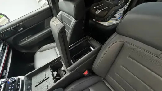
Speaking of which, I don’t remember coming across a double-opening center armrest bin like this. Lots flip left or right, but this one has access buttons on both ends. Why do you want it to open the other way?
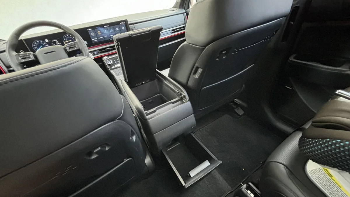
So those in the back can get access, that’s why. They also have a handy pull out bin.

Moving back up front, there is a now-common under console storage area. It has a rubberized floor to prevent whatever from sliding around.

Here’s another novelty. Though not strictly unique, having two wireless charge pads in a car is exceedingly rare. These are right-smack in the middle of the center console and you can see they feature little platforms that let the outer edges of your phone have access to air rather than suffocating against rubber.
You can also see the primary cupholders here, which were big enough to hold my wine-bottle-sized water bottle.

Moving into the back, there are additional cupholders in the doors. I’m a big fan of this feature, mostly because I can put my son’s daily water bottle for school right next to him where I can’t possibly miss it when getting him out of the car.
The hourglass shape allows for two cups or bottles, but is also intended to keep a phone on its side somewhat secure.
In this photo, you can also see that the Calligraphy has heated second-row seats. So does the Limited.

The front seat backs have little hooks and some Minecrafty embossments to spruce up what would otherwise be hard plastic. And before you complain about that hard plastic, I’d offer this is better to meet a kid’s dirty shoes than leather/pleather.
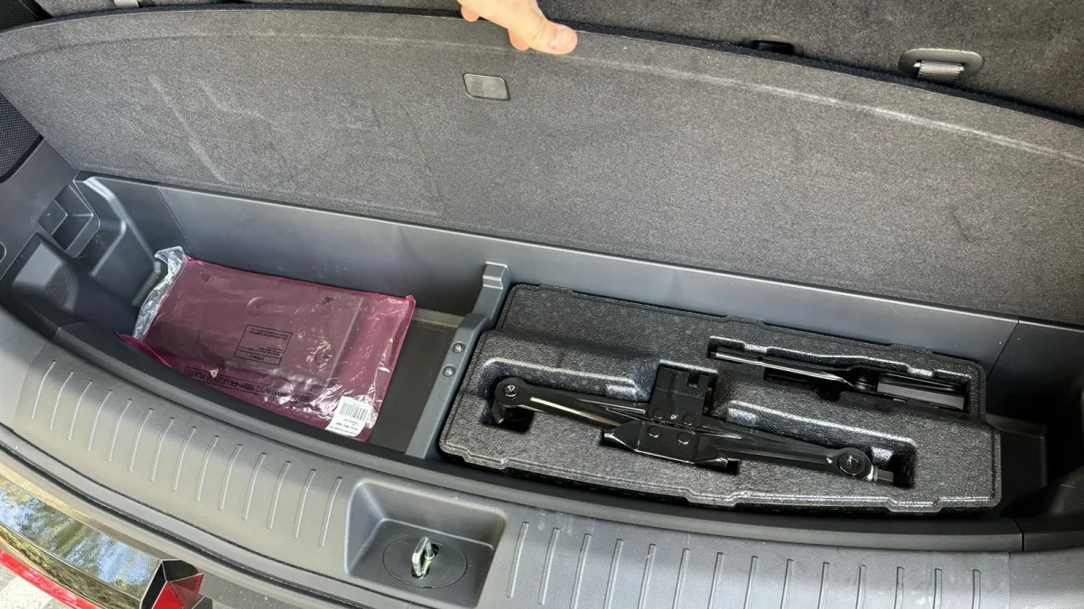
As shown in the Santa Fe Luggage Test, there is some underfloor storage behind the third row, but it’s indeed more “storage” than an expansion of the cargo area.


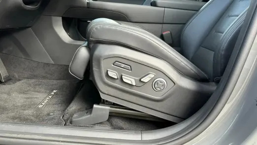
Let’s talk about the seats. These are exclusive to the Calligraphy: the “Relaxation Comfort” seat first seen in the Hyundai Ioniq 5 Limited. I like them because of how high you can arch up the front of the seat bottom and dive the back of it — I’m 6-foot-3, and sitting like this lets me sit closer to the wheel while providing under-thigh support and taking pressure off my lower back. A fellow editor once dubbed this “the birthing position.” Porsche seats can often do this, as could BMW seats in the 2000s.
For everyone else, putting this feature in the Santa Fe feels more like a “hey, why not?” feature. The Ioniq 5 has it, apparently, for relaxing while your car charges. You don’t have to do that with the Santa Fe. Waiting for the kids to come out of school, maybe? Whatever, let’s just go with “good for tall people.”


The second-row captain’s chairs in the Calligraphy are partially power-operated. They still slide fore-aft by pulling up on a bar and then moving the seat the old-fashioned way, or by pressing the quick-release button that slides it forward for third-row access.
Recline and seat-bottom tilt are then handled with electric motors. This is great for comfort, but impedes third-row access by making it … really … slow … to … put … the seatback … back. A common issue with power-operated second-row seats.

You can lower the second-row seatbacks with these buttons in the cargo area.

This is the third row. The seat is obviously quite flat, and it’s quite close to the floor. You will be more comfortable in a Palisade, regardless of how big you are. That said, scooting the second row up to free up some extra space for those in the third row still leaves plenty of space for those sitting in the second (even with a tall driver up front). Also note how much headroom there is thanks to that boxy roofline, which also contributes to big, square quarter windows that makes it feel airier and more spacious than is typical.

Speaking of airy, the Limited and Calligraphy have a dual-pane sunroof.

Back to the third row, which has air vents, hourglass double cupholders and a USB-C port on each side, plus a rear A/C fan control. The right side also has the 115-volt house-style electrical outlet that’s more of a cargo feature.

The second row has sunshades in the Calligraphy. I think these should be standard in every family vehicle.

Now let’s move up front and talk about technology and controls.

This has basically the same shifter design as the Ioniq 5 and 6. Twist forward for drive, backward for reverse and press the button on the end of it for park.
I have a tendency to want to do the opposite as the shifter’s monostable functionality is generally similar to center console electronic shifters that do forward for reverse and back for drive (see BMW).

There are different gauge layouts available, tied to drive mode if you’d like, but I just stuck with these. They are clean, easily read and go with the rest of the interior.

The Santa Fe has the same row of infotainment shortcuts as the Ioniq 5 N (which has removed the old Radio shortcut button for Search, booooooo), but it has more climate controls. Specifically, “buttons” for heated seats, ventilated seats and heated steering wheel. You don’t have to wait for the infotainment system to clear a lawyer screen, press a general seat/wheel button and then do something on the screen. That’s annoying. This isn’t.
Also note that the mechanically related Kia Sorento has these rows of infotainment and climate controls integrated into a common housing and flips back and forth between them. This is better than that.
You can also see the big Drive Mode toggle here. Can’t say I was inspired to press that in a Hyundai Santa Fe.
Oh, you can also see the little button for killing the gunk on your phone with UV-C.


The Limited and Calligraphy have multi-color ambient lighting. There are 10 preferred choices with snazzy names, or you can go beyond that with a larger color wheel. My son demanded pink per usual.


And finally, the infotainment system, because it pisses me off. This is Hyundai/Kia’s newest system and I don’t like what they’ve done. I DO like that it no longer defaults onto a nothing page with some scenery on it every time you turn the car on, and the shortcuts along the bottom are fine.
I listen to satellite radio, though, and what they’ve done to its interface is nonsensical. Since Sirius and XM debuted in cars nearly 20 years ago, a defining feature has been being able to see what song is playing. Furthermore, you’ve usually been able to see that information at the same time as your favorites list. That functionality is increasingly going away and I do not understand it. The Hyundai/Kia system is yet another culprit after previously doing Sirius XM controls totally normal and very well.
Look above left. The currently selected station, Alt Nation, is indicated in three different places: highlighted in the channel list, shown as a thumbnail at the right, and in the lower right hand corner with its station number, SXM 36. The only thing indicating what song is playing is the tiny thumbnail of album art, as if anyone is supposed to know what the hell that is. This is barely better than the plain-old radio face plate in my 25-year-old BMW that just says “FM 106.7.”
To find out what son is playing, you have to press that tiny thumbnail of album art. This takes over the entire damn screen (above right), and although you can now see the song info, it’s in small font in the lower right hand corner. VW and BMW now do this full-screen takeover, and I don’t get it. It makes you got back and forth, back and forth …
Oh, but can’t you use the split-screen functionality to show song info, you know, exactly where that Alt Nation logo is in the above left photo?


NO! I can’t fathom why Hyundai/Kia got rid of the option for seeing entertainment info in the split screen view. This is particularly helpful when using the native navigation system, or as some cars let you do, with Apple CarPlay.
In the new Hyundai/Kia system, split screen content lets you see a map on top of a map, the weather forecast, or my personal favorite, extremely detailed geographic coordinates just in case you need to call in a missile strike on yourself.
This obviously drives me bonkers. Why, Hyundai, why???
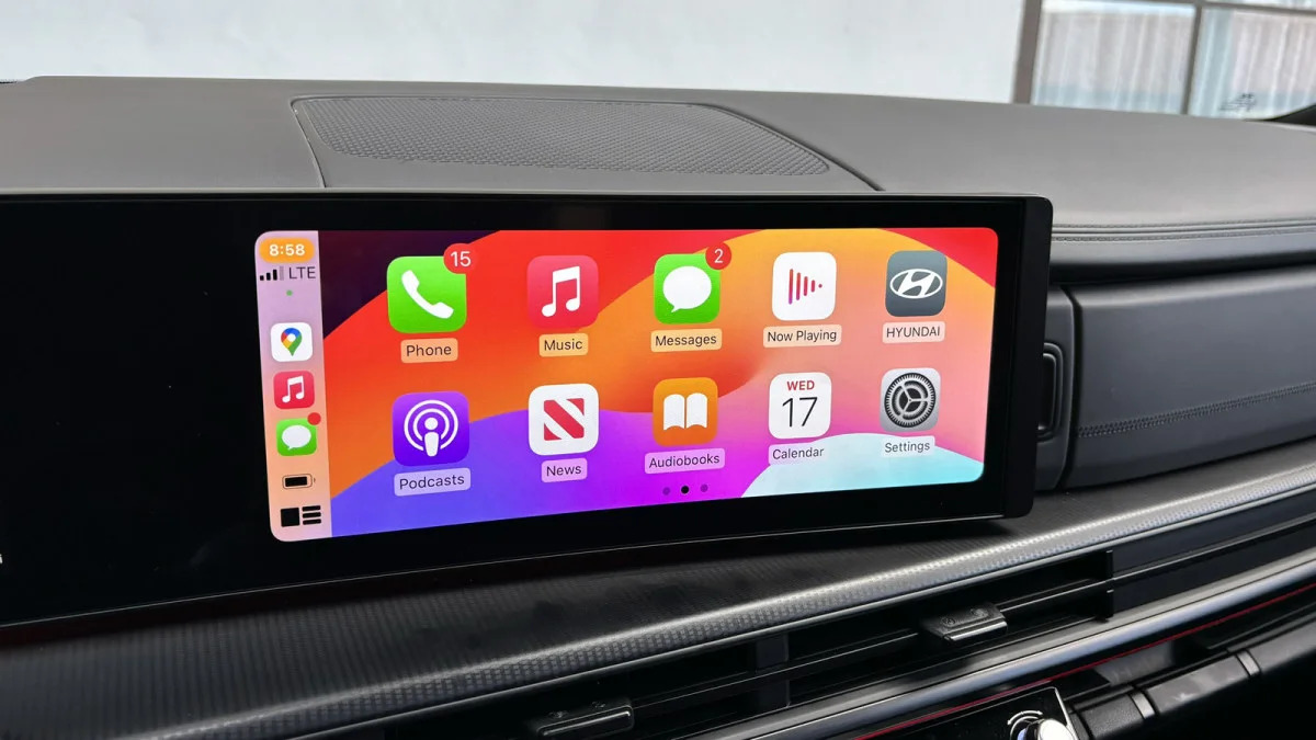
At this point, I can already hear people saying “Whatever, I just use Apple CarPlay.” Well then, here, it has it, and the shortcut buttons make it easy to escape.
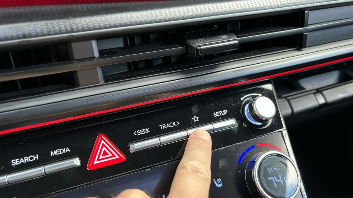
Hyundai/Kia has also maintained the little star button, which is customizable for access any number of options. I set it for phone projection, granting quick access to Apple CarPlay at the push of a button. Again, I can no longer press a Radio button to easily get back to that screwy radio screen, but don’t worry, I have easy access to Search for something. What, I don’t know. “Hey Hyundai, why is your radio UI terrible now?”
So, obviously, I’m no fan of the infotainment system changes, but everything else about the Santa Fe’s interior functionality is very impressive.

