Data Visualization:An Important Toolfor Insurance, Risk Management

By Max Dorfman, Research Writer, Triple-I
Data visualization has become an increasingly important tool for understanding and communicating complex risks and informing plans to address them.
Simply put, data visualization is the depiction of data through static or interactive charts, maps, infographics, and animations. Such displays help clarify multifaceted data relationships and convey data-driven insights.
The origins of data visualization could be considered to go back to the 16th century, during the evolution of cartography. However, modern data visualization is considered to have emerged in the 1960s, when researcher John W. Tukey published his paper The Future of Data Analysis, which advocated for the acknowledgement of data analysis as a branch of statistics separate from mathematical statistics. Tukey helped invent graphic displays, including stem-leaf plots, boxplots, hanging rootograms, and two-way table displays, several of have become part of the statistical vocabulary and software implementation.
Since Tukey’s advancements, data visualization has progressed in extraordinary ways. Matrices, histograms, and scatter plots (both 2D and 3D) can illustrate complex relationships among different pieces of data. And, in an age of big data, machine learning, and artificial intelligence, the possible applications of data science and data analytics has only expanded, helping curate information into easier to understand formats, giving insight into trends and outliers. Indeed, a good visualization possesses a narrative, eliminating the extraneous aspects of the data and emphasizing the valuable information.
Whether for tracking long-term rainfall trends, monitoring active wildfires, or getting out in front of cyber threats, data visualization has proved itself tremendously beneficial for understanding and managing risk.
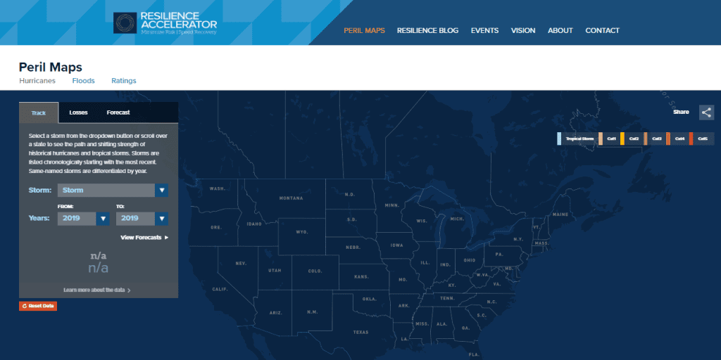
The Triple-I uses data visualization in its Resilience Accelerator to better illustrate the risks many communities face with natural disasters, particularly hurricanes, floods, and resilience ratings. Spearheaded by Dr. Michel Leonard, Chief Economist and Data Scientist, Head of the Economics and Analytics Department at the Triple-I, these data visualizations provide an ever-needed way to more effectively communicate these hazards, expanding the knowledge base of insurers, consumers, and policymakers.
To further understand data visualization, we sat down with Dr. Leonard.
Why is data visualization so essential in preparing for and responding to catastrophes? What immediately comes to mind is maps. We can make spreadsheets of policies and claims, but how do you express the relationships between each row in these spreadsheets? We can use data visualization to show how houses closest to a river are most at risk during a flood or show the likely paths of wildfires through a landscape. Before a catastrophe, these tools help us identify at-risk zones to bolster resilience. After a catastrophe, they help us identify areas that need the most to rebuild.
How can data visualization help change the way insurers confront the challenges of catastrophes? The most crucial aspect of data visualization for insurers is the potential to explore “what-if” scenarios with interactive tools. Understanding risk means understanding what range of outcomes are possible and what it most likely to happen. Once we start accounting for joint outcomes and conditional probabilities, spreadsheets turn into mazes. Thus, it’s important to illustrate the relationship between inputs and outputs in a way that is reasonably easy to understand.
With the increasing threat of climate risk, how much more significant do you anticipate data visualization will become? I’m reminded of the writings from the philosopher Timothy Morton, who described climate change as a “hyper-object”: a multifaceted network of interacting forces so complex, and with so many manifestations that it is almost impossible to fully conceptualize it in your head at once.
Climate change is complicated and communicating about the risks it creates is a unique problem. Very few people have time to read through a long technical report on climate risk and how it might affect them. Thus, the question becomes: How do we communicate to people the information they need in a way that is not only easy to understand but also engaging?
Images or infographics have always been compelling tools; however, we prefer interactive data visualization tools for their ability to capture attention and curiosity and make an impression.
How does the Resilience Accelerator fit into the sphere of data visualization? With the Resilience Accelerator, we wanted to explore the interplay between insurance, economics and climate risk, and present our findings in an engaging, insightful way. It was our goal from the beginning to produce a tool that would help policymakers, insurers, and community members could find their counties, see their ratings, compare their ratings with those of neighboring counties, and see what steps they should take to improve their ratings.
What motivated this venture into data visualization – and how can it help change the ways communities, policymakers, and insurers prepare for natural disasters? It’s our job to help our members understand climate-related risks to their business and to their policyholders. Hurricanes and floods are only the first entry in a climate risk series we are working on. We want our data to drive discussion about climate and resilience. We hope the fruits of those discussions are communities that are better protected from the dangers of climate change.
Where do you see data visualization going in the next five to 10 years?
I’m interested in seeing what comes from the recent addition of GPU acceleration to web browsers and the shift of internet infrastructure to fiber optics. GPU acceleration is the practice of using a graphics processing unit (GPU) in addition to a central processing unit (CPU) to speed up processing-intensive operations. Both of these technologies are necessary for creating a 3-D visualization environment with streaming real-time data.


